height_data <- medisr::height_data19 Exercises: When in doubt, plot it out
TipHallo Medical Statistics
Pre-requicite for these exercises was covered within the session and is therefore not repeated here. The exercises build on this material.
19.1 Exercises: “Let’s first see what the data are telling us”
You are given a dataset containing demographic measurements from !Kung San individuals, including age, height, weight, and sex.
The research team wants to explore a simple question:
How do height and weight vary with age, and do these patterns differ between males and females?
Before drawing conclusions, the team wants to first understand the data visually. In particular, they want to examine the distributions of height and weight, compare males and females, and explore relationships between the continuous variables.
The Professor asks you to start by asking:
Which visualization is most appropriate for each question?
19.1.1 A: Preparing to start plotting
Before we can plot anything, we need our data and we need to know which state and format it’s in. This sections shows a common workflow to do this.
Exercise 1A:
Import the Height dataset into R — see Section 17.14 for more info.
Click for the solution
Exercise 2A:
View the dataset.
- How many observations do we have?
- How many variables?
- What type are they?
Click for the solution
View(height_data) <- medisr::height_data- 544
- 4
- all numeric (
dblandint)
this is easier to see if you make the dataset a tibble
height_data |>
    tibble::as_tibble()
# A tibble: 544 × 4
height weight age male
<dbl> <dbl> <dbl> <int>
1 152. 47.8 63 1
2 140. 36.5 63 0
3 137. 31.9 65 0
4 157. 53.0 41 1
5 145. 41.3 51 0
6 164. 63.0 35 1
7 149. 38.2 32 0
8 169. 55.5 27 1
9 148. 34.9 19 0
10 165. 54.5 54 1
# ℹ 534 more rowsExercise 3A:
Are we happy with going strait to plotting or do we need to wrangle the dataset a bit with dplyr first?
Click for the solution
male is obviously not continuous but rather a yes/no factor. So we should consider this later before comparing males and females.19.1.2 B: Exploratory data analysis with plotting
It is extremely useful (and often necessary) to plot your data before you start doing any statistics or conclusions. This section covers a typical workflow.
Exercise 1B:
The variable male is coded as 0 and 1. Before plotting, convert it into a factor with meaningful labels:
-
0should represent"Female" -
1should represent"Male" - Print the resulting variable to check that the transformation worked.
Click for the solution
  [1] Male   Female Female Male   Female Male   Female Male   Female
 [10] Male   Female Male   Female Female Female Male   Male   Female
 [19] Male   Female Female Male   Female Male   Female Male   Female
 [28] Female Male   Female Male   Male   Male   Female Female Female
 [37] Female Female Female Male   Male   Male   Male   Female Female
 [46] Female Male   Female Female Male   Female Male   Male   Male
 [55] Female Female Male   Female Female Female Female Male   Female
 [64] Male   Female Female Female Male   Male   Female Male   Female
 [73] Male   Female Female Male   Female Male   Male   Female Female
 [82] Female Female Male   Male   Female Male   Male   Female Female
 [91] Male   Female Male   Male   Female Male   Female Female Male
[100] Female Male   Female Male   Female Female Male   Male   Female
[109] Female Male   Male   Male   Female Female Male   Male   Male
[118] Female Male   Female Male   Male   Male   Male   Female Female
[127] Male   Male   Male   Female Female Male   Male   Male   Female
[136] Male   Female Female Male   Male   Female Male   Female Male
[145] Female Female Female Female Male   Male   Female Female Male
[154] Male   Female Female Female Male   Male   Female Male   Male
[163] Female Female Female Male   Female Male   Female Female Female
[172] Female Female Female Male   Female Female Male   Male   Female
[181] Male   Female Male   Male   Male   Female Female Male   Male
[190] Female Male   Female Female Female Female Female Female Male
[199] Female Male   Male   Female Male   Male   Female Male   Female
[208] Male   Female Male   Female Female Female Male   Male   Female
[217] Male   Male   Female Female Male   Male   Male   Male   Male
[226] Female Male   Male   Female Female Female Female Female Male
[235] Female Male   Female Male   Female Female Female Female Female
[244] Male   Female Male   Male   Female Female Female Female Male
[253] Male   Female Male   Female Male   Male   Female Male   Female
[262] Male   Female Female Female Female Female Male   Male   Female
[271] Male   Male   Female Female Male   Female Male   Female Female
[280] Female Female Female Female Male   Male   Male   Female Male
[289] Male   Female Female Female Male   Female Male   Female Female
[298] Male   Female Female Female Female Male   Female Male   Female
[307] Female Female Female Male   Female Male   Male   Male   Female
[316] Female Male   Male   Male   Female Male   Female Female Male
[325] Male   Female Male   Female Female Female Female Female Male
[334] Female Male   Female Male   Male   Female Male   Female Male
[343] Female Female Female Male   Female Female Male   Male   Male
[352] Male   Male   Female Male   Male   Female Female Male   Female
[361] Male   Female Female Male   Female Female Female Male   Male
[370] Female Female Male   Female Female Male   Male   Male   Female
[379] Female Male   Female Female Male   Male   Female Female Female
[388] Female Male   Female Male   Male   Female Male   Male   Female
[397] Male   Female Male   Female Male   Male   Male   Female Male
[406] Male   Female Male   Male   Female Male   Male   Female Male
[415] Female Female Female Male   Female Female Male   Male   Female
[424] Male   Female Male   Male   Male   Male   Male   Female Male
[433] Male   Male   Male   Male   Male   Male   Female Male   Female
[442] Male   Female Female Female Male   Male   Female Male   Male
[451] Male   Female Female Male   Female Female Male   Male   Male
[460] Male   Male   Female Female Female Female Male   Female Male
[469] Female Female Female Female Male   Female Female Male   Male
[478] Female Male   Female Female Male   Female Male   Male   Female
[487] Male   Male   Male   Female Male   Female Male   Female Female
[496] Female Female Male   Male   Male   Male   Male   Female Male
[505] Female Male   Female Female Male   Male   Female Female Male
[514] Female Female Female Female Female Female Female Male   Male
[523] Female Male   Female Male   Female Female Male   Female Female
[532] Female Male   Female Female Male   Female Female Male   Male
[541] Male   Female Male   Male
Levels: Female Male
Exercise 2B:
Create a plot that proofes to yourself that the median age of males and females are similar within the dataset.
- What will you put on the x-axis?
- What will you put on the y-axis?
- Any color coding?
- Which
geom_?
First draw it so that the two groups have similar age in the population. Consider the fact that this is a demographic study with the entire population of the Kalahari !Kung San people (so we have a wide range of ages).
Second implement the plot in R.
Click for the solution
height_data |>
  ggplot(
    aes(
      x = male,
      y = age,
      color = male
    )
  ) +
  geom_boxplot()
Exercise 3B:
Investigate whether the relationship between height and weight appears to be linear.
Create a scatter plot with:
- What will you put on the x-axis?
- What will you put on the y-axis?
- Any color coding?
- Which
geom_?
Then answer:
- Does weight increase approximately linearly with height?
- Does the shape of the relationship look similar for males and females?
- Is there evidence that one sex tends to weigh more at the same height?
Click for the solution
height_data |>
  ggplot(
    aes(
      x = height,
      y = weight,
      color = male
    )
  ) +
  geom_point() +
  geom_smooth()
`geom_smooth()` using method = 'loess' and formula = 'y ~ x'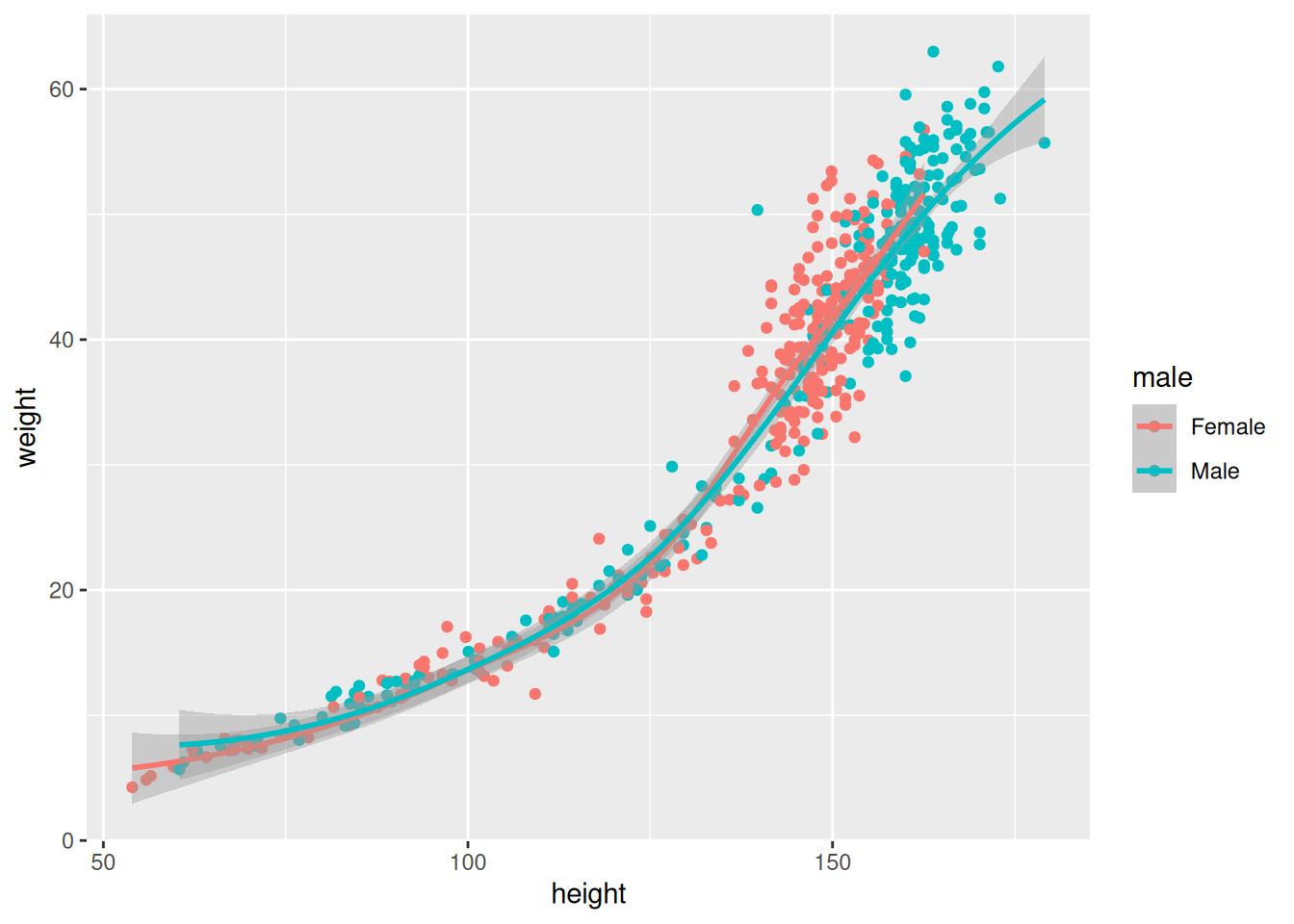
19.1.3 C: Fitting a hypothesis with a plot type
Finally, plots often accompany hypothesis. We want to show the reader of our plot that it supports a specific conclusion. Here, you get experience fitting plot types with hypotheses.
Exercise 1C:
A researcher wants to investigate the following hypothesis:
Hypothesis: There is more variability in male height than in female height.
Which visualization would be most appropriate?
Explain why you chose this visualization and what features of the graph you would look at to evaluate the hypothesis.
Now implement it using ggplot2.
Click for the solution
Code depends on your plot of choice 👀
Example:
height_data |>
  ggplot(
    aes(
      x = height,
      color = male
    )
  ) +
  geom_density()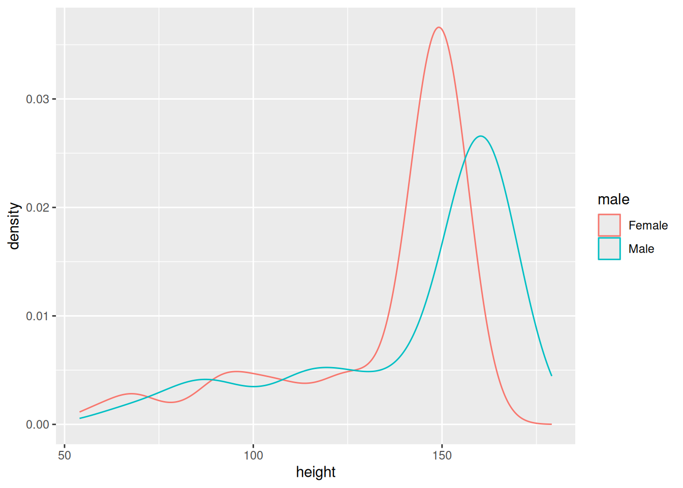
Exercise 2C:
Consider the hypothesis:
Hypothesis: Males have higher body weight than females.
Which visualization would be most appropriate?
Explain your reasoning and implement the plot using ggplot2.
Click for the solution
Did you choose box plot? 👀
Example:
height_data |>
  ggplot(
    aes(
      x = male,
      y = weight,
      color = male
    )
  ) +
  geom_boxplot()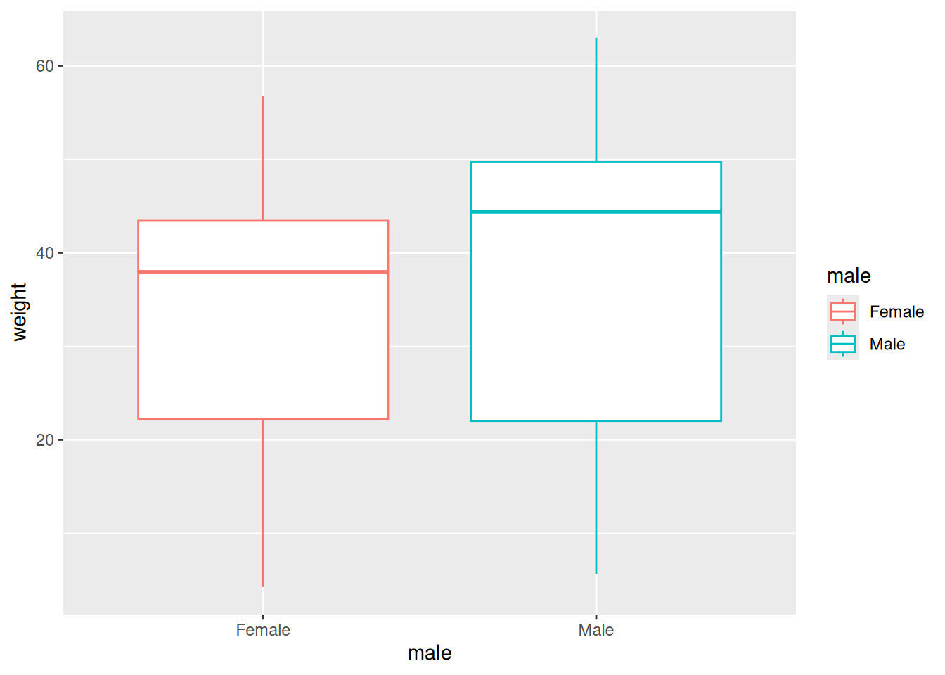
Exercise 3C:
Consider the hypothesis:
Hypothesis: Females increase their height earlier in development than males.
Which visualization would be most appropriate?
Explain your reasoning and implement the plot using ggplot2.
Click for the solution
example:
height_data |>
  ggplot(
    aes(
      x = age,
      y = height,
      color = male
    )
  ) +
  geom_point() +
  geom_smooth() +
  xlim(c(0,20)) # this line helps a lot by zooming in at the age of interest!
`geom_smooth()` using method = 'loess' and formula = 'y ~ x'Warning: Removed 331 rows containing non-finite outside the scale range
(`stat_smooth()`).Warning: Removed 331 rows containing missing values or values outside the scale
range (`geom_point()`).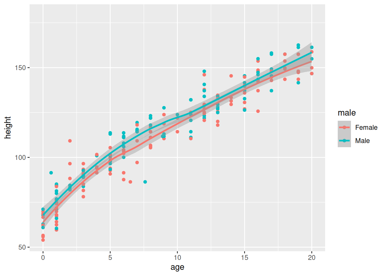
Exercise 4C: Compare the geom_smooth() curves for males and females.
Look at the graph and answer:
- At approximately what age does height stop increasing rapidly?
- Does height appear to reach a plateau?
- Do males and females reach this plateau at approximately the same age?
- Which sex appears to reach a greater adult height?
- Are there ages where the difference between males and females appears particularly large?
Click for the solution
There is no single numerical answer to these questions. Use the smoothed curves to describe the pattern in the data.
In particular, compare where each curve changes from a steep increase to a relatively flat section. Also compare the approximate height of the two curves during adulthood.
The exact age at which growth “stops” cannot be determined simply by looking at the graph, but the geom_smooth() curves can help identify an approximate age range where height becomes relatively stable.