14 A fishy counting trick
“Choose to be optimistic, it feels better.” — Dalai Lama
14.1 Pree-class Literature
- Todays dataset (Epilepsy Clinical Trial)
- Chapter 4.6 (pages 164—-171) in Introduction to statistical learning with R 2nd edition (click “Download ISL with R”)
14.2 Slides
NoteTeacher note
The slides contain speaking notes that you can view by pressing ‘S’ on the keyboard.
14.3 Case session 12: “Why are seizure data always right-skewed?”
At PhaRmacy Inc., excitement is growing over a new anti-seizure medication, progabide. A randomized clinical trial has just finished, and the lead investigator walks into the weekly research meeting with a smile and says:
“The treatment group had fewer seizures.”
Everyone celebrates but one brave person leans forward and asks:
“Fewer… according to what model?”
The lead investigator acknowledges the questions and provides the available data.
Looking at the raw data raises more questions than answers. The outcome is the number of seizures each patient experienced during the study. Some patients had only a handful of seizures, while others had dozens, and a few appear very different from the rest. The distribution is highly skewed and doesn’t resemble the continuous, normally distributed outcomes you’re used to analyzing. At the same time, the outcome is clearly not binary, so a logistic regression model would not be appropriate either.
As a member of the clinical development team, you have been asked to review the trial results before they are presented to management. Your role is to work with the biostatistics group to ensure that the data are analyzed using an appropriate model and that the conclusions about progabide’s effectiveness are scientifically sound.
At the upcoming project meeting, you’ll need to explain why some familiar regression models are not suitable for these data, recommend a more appropriate approach, and interpret what the analysis tells the team about the effect of progabide after accounting for patients’ baseline seizure frequency.
14.4 Data Example
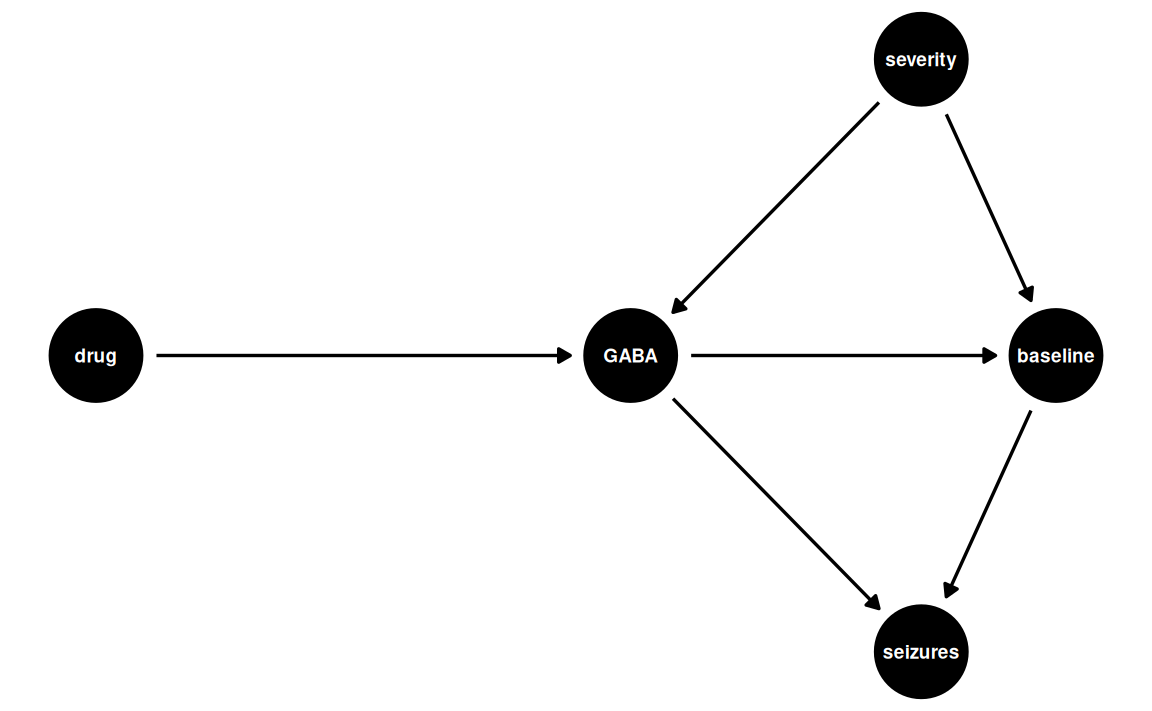
Before doing anything with statistics and code, we should try to imagine how the data were generated in order to make a causal model.
14.4.1 Exercise: Discuss the causal mechanisms of progabide
Discuss how progabide might work and how baseline seizure frequency might tie into this. You may look at the wikipidia page for progabide, but don’t overcomplicate your model.
Click for a potential solution
While baseline is not a coufounding, we’ll condition on it anyway to:
- increases precision (reduces residual variance)
- account for chance imbalance at baseline (since this is a small sample size)
- improve power
This is called precision adjustment or covariate adjustment, not confounding adjustment.
14.4.2 Exploring the data for familiarization
Let’s explore the dataset a bit — but before we do, I’ll do some tidying of the dataset using dplyr for wrangling. I’m not gonna explain this bit, as you can go back to session 8 by Rasmus for working with dplyr for wrangling.
epil <- MASS::epil # this is not from medisr

epil <- epil |>
    rename(
        seizure_count = y,
        drug = trt,
        baseline_seizures = base,
        trial_end = V4,
        log_base = lbase,
        log_age = lage
  ) |>
    filter(trial_end == 1) |>
    mutate(
        seizure_count = as.integer(seizure_count),
        period = factor(period,
            levels = c(4),
            labels = c("week_8")
            )
    )
Now, let’s take a glipse of what data we have:
epil |>
    dplyr::glimpse()
Rows: 59
Columns: 9
$ seizure_count <int> 3, 3, 5, 4, 21, 7, 2, 12, 5, 0, 22, 4, 2, 14…
$ drug <fct> placebo, placebo, placebo, placebo, placebo,…
$ baseline_seizures <int> 11, 11, 6, 8, 66, 27, 12, 52, 23, 10, 52, 33…
$ age <int> 31, 30, 25, 36, 22, 29, 31, 42, 37, 28, 36, …
$ trial_end <int> 1, 1, 1, 1, 1, 1, 1, 1, 1, 1, 1, 1, 1, 1, 1,…
$ subject <int> 1, 2, 3, 4, 5, 6, 7, 8, 9, 10, 11, 12, 13, 1…
$ period <fct> week_8, week_8, week_8, week_8, week_8, week…
$ log_base <dbl> -0.75635379, -0.75635379, -1.36248959, -1.07…
$ log_age <dbl> 0.11420370, 0.08141387, -0.10090768, 0.26373…And let’s see how many were assigned each arm of the RCT:
epil |>
    count(drug)
# A tibble: 2 × 2
drug n
<fct> <int>
1 placebo 28
2 progabide 31So 59 patients in total with pretty balanced groups.
Now, let’s look at a histogram of the baseline_seizures and seizure_count:
seizure_lims <- range(c(epil$baseline_seizures, epil$seizure_count))

baseline_data_plot <- epil |>
    ggplot() +
    geom_histogram(
        aes(x=baseline_seizures),
        bins=30
    ) +
    coord_cartesian(xlim = seizure_lims)

posttrial_data_plot <- epil |>
    ggplot() +
    geom_histogram(
        aes(x=seizure_count),
        bins=30
    ) +
    coord_cartesian(xlim = seizure_lims)

# This part takes the two ggplot's and puts them side-by-side using {patchwork}
library(patchwork)
baseline_data_plot + posttrial_data_plot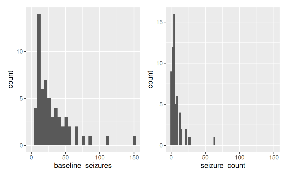
By looking at the data, it’s difficult to really see whether the average seizure_count decreases, but some of the extreme cases do seem to shrink.
We should also consider the relationship between baseline_seizures and seizure_count:
epil |>
    ggplot(aes(baseline_seizures,seizure_count,color=drug)) +
    geom_point(alpha=0.6) +
    geom_smooth()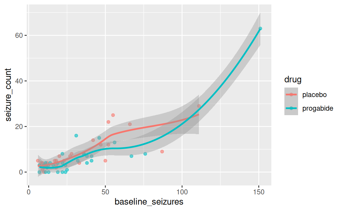
It definitely looks like there’s an association between baseline_seizures and seizure_count, so in accordance with our medical scientific model from Figure 14.1, we better include this in the statistical model to account for this relationship.
Recall the case:
We want to know the difference in prevalence (here, more specifically, count rate) of getting seizures after being prescribed progabide.
14.5 Can we use logistic regression?
This is an ultra quick recap of logistic regression. See session 10 on logistic regression by Carsten for a comprehensive recap.
Logistic regression uses the binomial distribution:
\[ outcome \sim Binomial(N,p) \] where N is the trial count and p is the probability, which we are interested in estimating with our model.
- We use the binomial distribution with logit link to model the outcome as the probability of event A.
- These are discrete counts, but we are interested in the overall probability of getting outcome A.
- Only two outcomes: 0 or 1 (heads or tails, dead or alive, left or right)
- The logit link transforms our outcome variable to a linear space called log-odds that goes from \(-\infty\) to \(\infty\).
- The logistic function transforms our data back to the outcome space (probabilities that goes from 0—1).
14.6 Reading Task: When the odds are low, go Poisson!
As the case states, we did not manipulate how many seizures the patients were able to get in the trial period. While we could assume that the baseline was the maximum, it would completely break the logistic regression if we got more seizures after — aka higher than 100% probability 😅
While the binomail distribution is great when N is known (trial count), there exists studies where you don’t know the upper limit (counting fish, selling a product, etc.) — what is the upper bound of fish in a lake we haven’t fully accounted for?
If we don’t know N, we cannot use the binomial!
Luckily, there’s a trick for this. When N becomes huge and p becomes really small, the binomial distribution takes a special shape — the Poisson distribution.
Explained mathematically:
The expected value of a binomial distribution is just \(Np\) (probability scale), and its variance \(Np(1 - p)\). But when N is very large and p is very small, the variance and expected value is the same.
E.g., you have 1 in 1000 probability of getting a price.
As a result, the distribution only has one parameter, λ (pronounced lambda).
\[ y_i \sim Poisson(λ) \]
This solves several issues:
- We can now model counts and probabilities (actually, rates, but more on this later) without being in control of the experiment and knowing the finite trial count
- We can model events with extremely low probability in counts per sample instead of probability per trial
- We only need one parameter for both the mean and the variance, effectively saving a degree of freedom.
But how can we do this in practice?
14.6.1 Which link?
As a link function, we often use log.
\[ y_i \sim Poisson(λ_i) \\ log(λ_i) = α + β(x_i - \bar{x}) \] Why log?
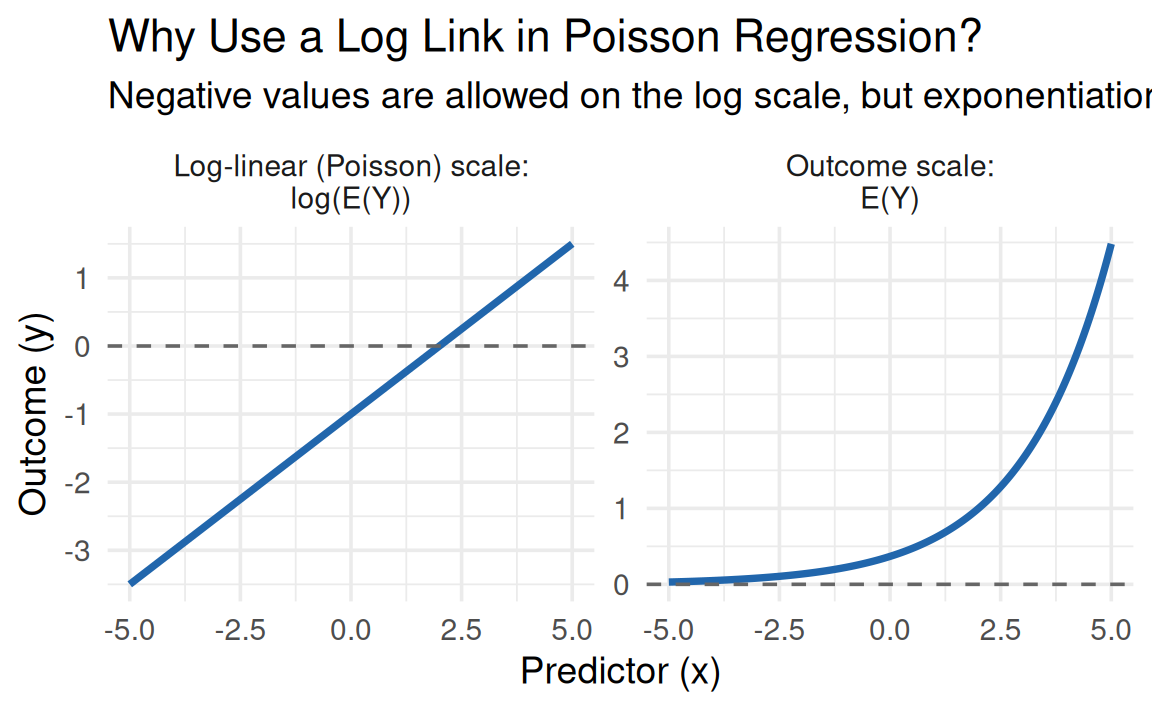
As illustrated in Figure 14.3, taking the log of any positive number is free to take any value between \(-\inf \to \inf\). This space is called log-linear because it is linear in log-space. Importantly, we want the outcome space to be bounded between \(0 \to \inf\). We get back to outcome space using the inverse-log transform (more on this in Section 14.10). So the trick is similar to the logistic regression, but without ceiling to 1.
- Notice that the log space is linear (what we model)
- The logistic space has an exponential shape (the transformation we apply)
Note that the log-link has the same flaws and benefits from the binomial distribution.
Pros:
- ensures positive values (for prediction)
Cons:
- implies exponential relationship with predictors
- Grow very rapidly — therefore, very sensitive to range
- it cannot keep being exponential!
14.7 Discussion task: Gaussian vs Poisson for seizure counts:
So we can use the good-old Gaussian linear regression or this new thing: Poisson regression.
Discussion the following facts with your neighbor:
If we model the mean and variance of the seizure count, we would expect that taking the mean and variance of the dataset and feeding it into a distribution would closely resemble the data. Let’s try that with Gaussian distribution and a Poisson distribution:
mu <- mean(epil$seizure_count) # 7.305085
sigma <- sd(epil$seizure_count) # 9.649467

set.seed(363461174)
dist_draws <- data.frame(
    gaussian = rnorm(1000,mu,sigma),
    poisson = rpois(1000,mu)
    ) |>
    tidyr::pivot_longer(
        cols = c("gaussian","poisson"),
        names_to = "dist",
        values_to = "value"
    )

dist_draws |>
    ggplot() +
    geom_histogram(
        aes(x=value),
        bins=30
    ) +
    facet_wrap(~dist) +
    labs(
        x="Seizures",
        y="Count (a.u.)"
    ) +
    theme(axis.text.y = element_blank())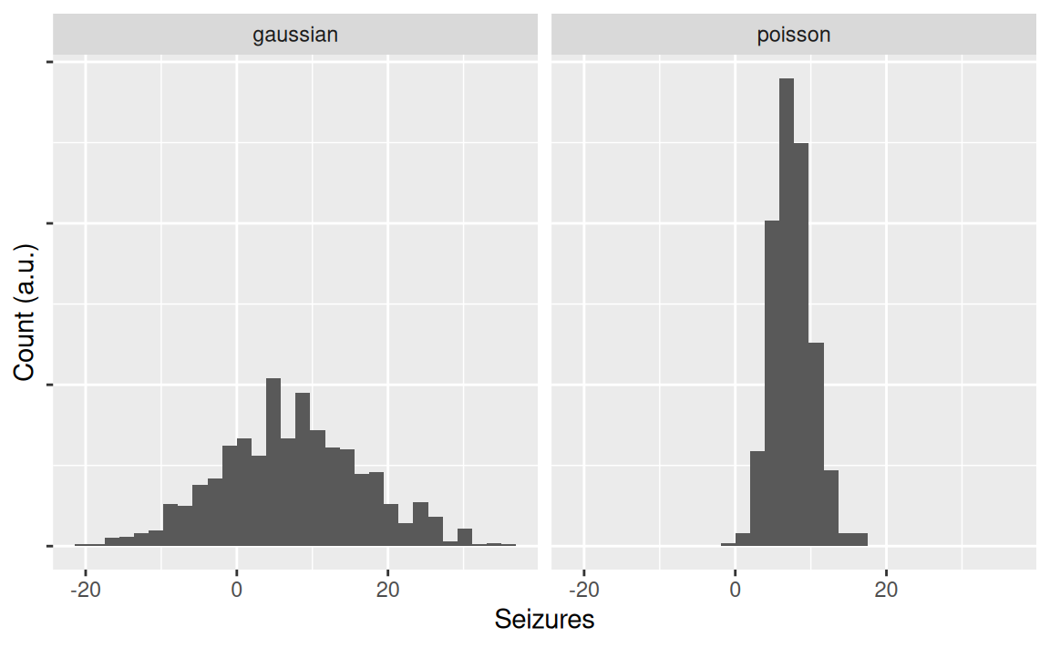
What do you notice? Compare the plots to the observed data we plotted in Figure 14.2.
- Which best captures the data?
- Which makes the worst fit?
- What else do you notice?
14.8 Proposing a model
First, we should propose a model. Looking at our causal medical model and the data-generating distributions, we’re going to go with the following formulation:
\[ seizure\_count_i \sim Poisson(λ_i) \\ log(λ_i) = α + β_1 baseline\_seizures + β_2 drug \]
- The model says that we believe
seizure_countis Poisson distributed - We use a log link function
- We expect an intercept, α
- A covariate
baseline_seizures - An effect of
drug
14.9 Fitting a Poisson model
Let’s try fitting a simpler model first: only the intercept and the drug effect, not accounting for baseline seizure burden.
Recall that (generalized) linear regression models that needs a link function is made using the glm function.
Great! Now, let’s explore the content of it.
parameters::parameters(m1_drug)# A tibble: 2 × 9
Parameter Coefficient SE CI CI_low CI_high z df_error
<chr> <dbl> <dbl> <dbl> <dbl> <dbl> <dbl> <dbl>
1 (Intercept) 2.07 0.0670 0.95 1.94 2.20 31.0 Inf
2 drugprogabide -0.171 0.0964 0.95 -0.361 0.0174 -1.78 Inf
# ℹ 1 more variable: p <dbl>Yeah, we did it! But… What does the coefficients actually mean? Did we come any closer to answering our medical question: did the drug reduce epilepsy?
And why does the output say:
The model has a log- or logit-link. Consider using
exponentiate = TRUEto interpret coefficients as ratios.
14.10 Reading task: GLMs are notoriously difficult to interpret
Let’s have a look at the coefficients:
coef(m1_drug) (Intercept) drugprogabide
2.0749673 -0.1714164 What does it mean?
Unless you’re a chatbot, I’m not sure you can read anything major from these coefficients. It’s because they’re still in log-linear space (described in Figure 14.3)!
So what do we do? Feed them to the chat model? Please don’t! 😅
Similar to the logistic regression, we have to apply the opposite transformation we did in the first place to get interpretable inference. In statistical terminology, the function that can transform the model back to it’s outcome unit is called the inverse link function. And the “opposite” mathematical operation to log is to exponentiation.
Let’s convert the coefficients back from log-count ratios to count ratios. We do this by exponentiating the value:
\[ e^{coefficient} \]
In R, we can use broom to tidy the model coefficients and generate confidence intervals:
broom::tidy(m1_drug,
     exponentiate = TRUE,
     conf.int = TRUE)
# A tibble: 2 × 7
term estimate std.error statistic p.value conf.low conf.high
<chr> <dbl> <dbl> <dbl> <dbl> <dbl> <dbl>
1 (Intercept) 7.96 0.0670 31.0 8.36e-211 6.96 9.06
2 drugprogabi… 0.842 0.0964 -1.78 7.54e- 2 0.697 1.02or you can use parameters::parameters(), which has a slightly different style:
parameters::parameters(m1_drug,exponentiate = TRUE)# A tibble: 2 × 9
Parameter Coefficient SE CI CI_low CI_high z df_error
<chr> <dbl> <dbl> <dbl> <dbl> <dbl> <dbl> <dbl>
1 (Intercept) 7.96 0.533 0.95 6.96 9.06 31.0 Inf
2 drugprogabide 0.842 0.0812 0.95 0.697 1.02 -1.78 Inf
# ℹ 1 more variable: p <dbl>That’s more like it! 🎉
The intercept reads 7.9642857, which is the expected seizure_count for the placebo group (and the average as we would expect!) Confirm this for yourself using the following code: mean(subset(epil,drug=="placebo")$seizure_count).
Next, it’s the \(β1_{drug}\) named drugprogabide in R: 0.8424707, which is the expected count ratio in seizure_count when being on progabide for 8 weeks, compared to placebo. Since the count ratio less than 1, the expected seizure count is lower.
In fact, 15.8% lower on average. To confirm this for yourself, run the following code: mean(subset(epil,drug=="progabide")$seizure_count) and see the average count for the treatment group. Finally, prove to yourself that this is what the two coefficients mean in relation to each other by this code: exp(m1_drug$coefficients[2])*mean(subset(epil,drug=="placebo")$seizure_count). So the expected effect of being on progabide for 8 weeks was a reduction of 1.2546083 seizures during 8 weeks, based on this small sample.
So far so good! 😄
We were able to do this nice sanity check for ourselves because the model only had an intercept and a binary (0/1) covariate. When we add more covariates or a continuous variable, things start to complicate really fast. We’ll learn how to handle that in Chapter 15. Still, making simplar models as a first step to make sanity checks is always good practice! When doing real research, this is absolutely necessary.
14.11 Fitting a Poisson regression model with covariates
While the model we’ve been using so far is not wrong, it’s also rather simple. Until now, we have estimated the average change in seizure count, not taking into account how many seizures patients had before taking the drug.
Adding the baseline covariate will increase the precision of the model and provide better predictions for different patients, depending on their disease severity.
TipAdding covariates are no simple game!
Had the study been a large-scale RCT study, we would probably not incl. the baseline seizure burden in the adjustment set. This is because the variable is actually not a confound for this dataset, as we randomized who got offered the drug treatment.
However, as the sample size is rather small, we cannot assume a 100% successful randomization (aka groups might not be exactly comparable). Furthermore, adding informative covariates increase precision and predictive performance. You’ll learn more about prediction later.
For now, take this assignment as a practice in fitting multiple covariates to a Poisson regression.
Ask an instructor if you’re interested in discussing this topic further.
So we want to condition on baseline_seizures. Let’s to that:
# A tibble: 3 × 7
  term          estimate std.error statistic  p.value conf.low conf.high
  <chr>            <dbl>     <dbl>     <dbl>    <dbl>    <dbl>     <dbl>
1 (Intercept)      3.37    0.0855      14.2  9.07e-46    2.84      3.98
2 drugprogabide    0.730   0.0985      -3.20 1.37e- 3    0.601     0.885
3 baseline_sei…    1.02    0.00104     20.7  1.73e-95    1.02      1.02
let’s compare the models:
coef_df <- bind_rows(
  tidy(m1_drug, conf.int = TRUE, exponentiate = TRUE) |> mutate(model = "Model 1 - drug only"),
  tidy(m2_baseline, conf.int = TRUE, exponentiate = TRUE) |> mutate(model = "Model 2 - add baseline seizure")
)

coef_df |>
  ggplot(aes(x = estimate, y = model)) +
  geom_vline(xintercept = 1, linetype = "dashed", colour = "grey50") +
  geom_point(size = 2) +
  geom_errorbar(
    aes(xmin = conf.low, xmax = conf.high),
    width = 0.2
  ) +
  facet_wrap(~term, scales = "free_x") +
  labs(
    x = "Coefficient estimate (95% CI)",
    y = NULL
  ) +
  theme_minimal()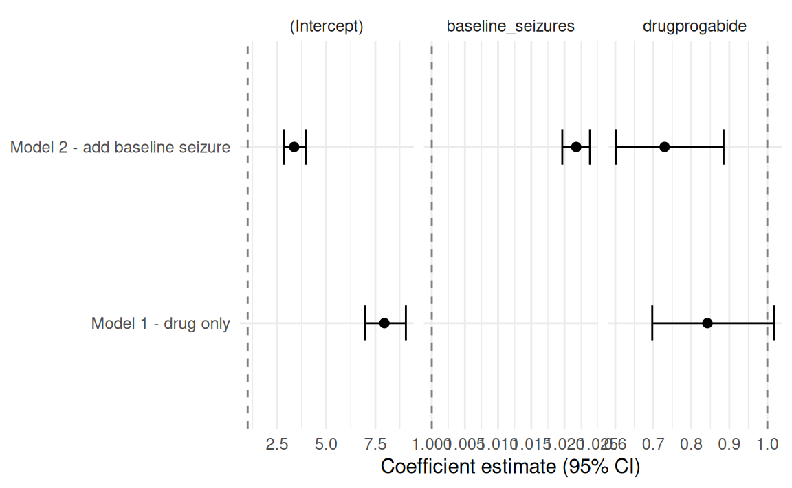
Note that both coefficients changed substantially.
But how do we interpret these models?
14.11.1 Reading task: Making sense of Poisson coefficients
The easies way to understand the model coefficients is to make marginal plots. You will learn more about marginal effects in Chapter 15.
We’ll use the marginaleffects package for this.
Here, we plot the expected seizure count at the 8 week follow up for m1_drug
m1_drug |>
    plot_predictions(
    condition=c("drug")
    ) +
    labs(
    y="Predicted seizures"
)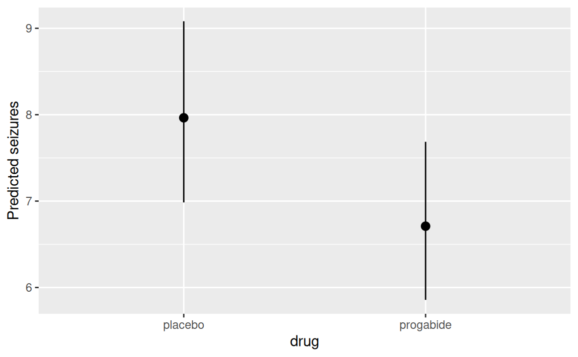
Notice that we only have point estimates (progabide == 0/1) with confidence intervals (\(\hat{y} ± 1.96 × SE(\hat{y})\)).
For m2_baseline, we add a continuous variable, which makes things more complicated:
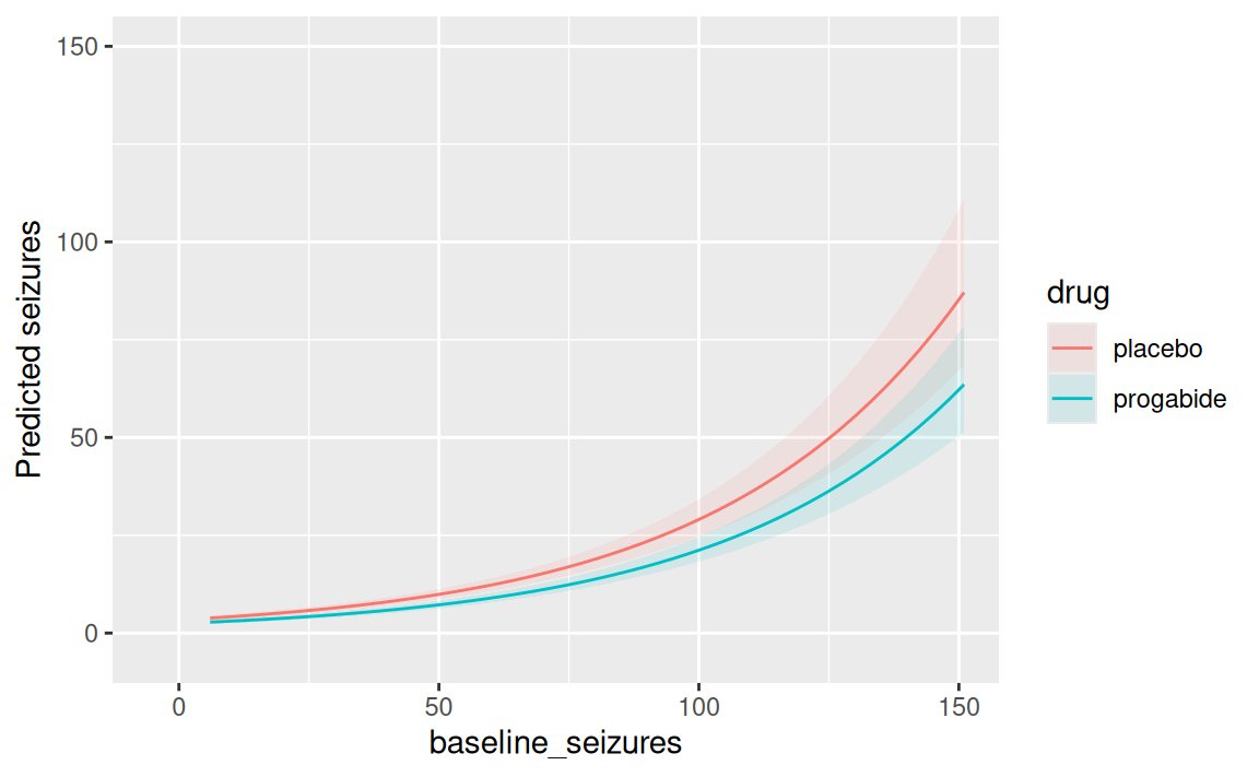
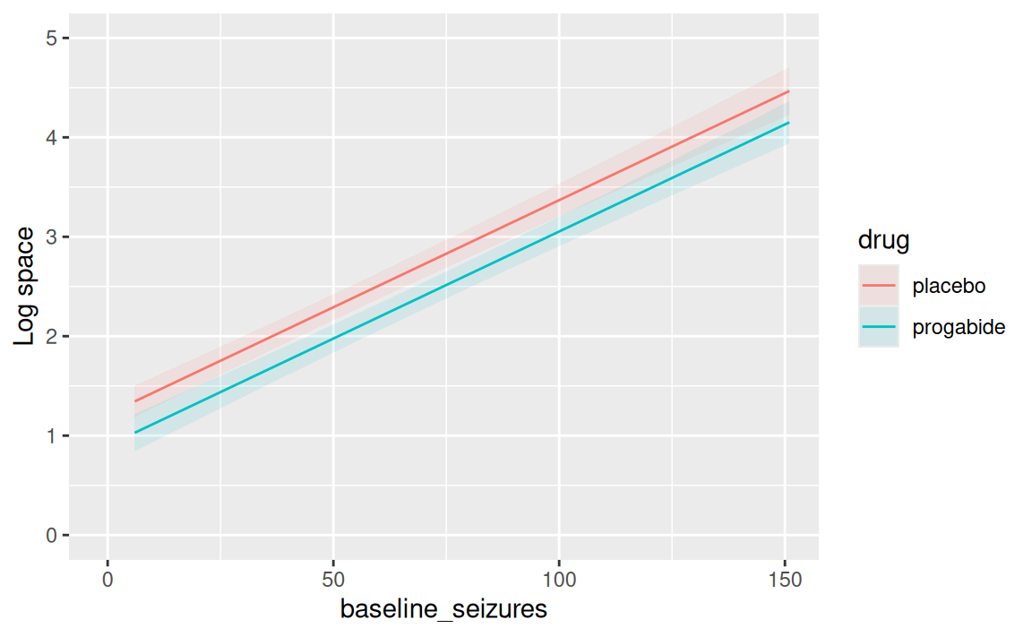
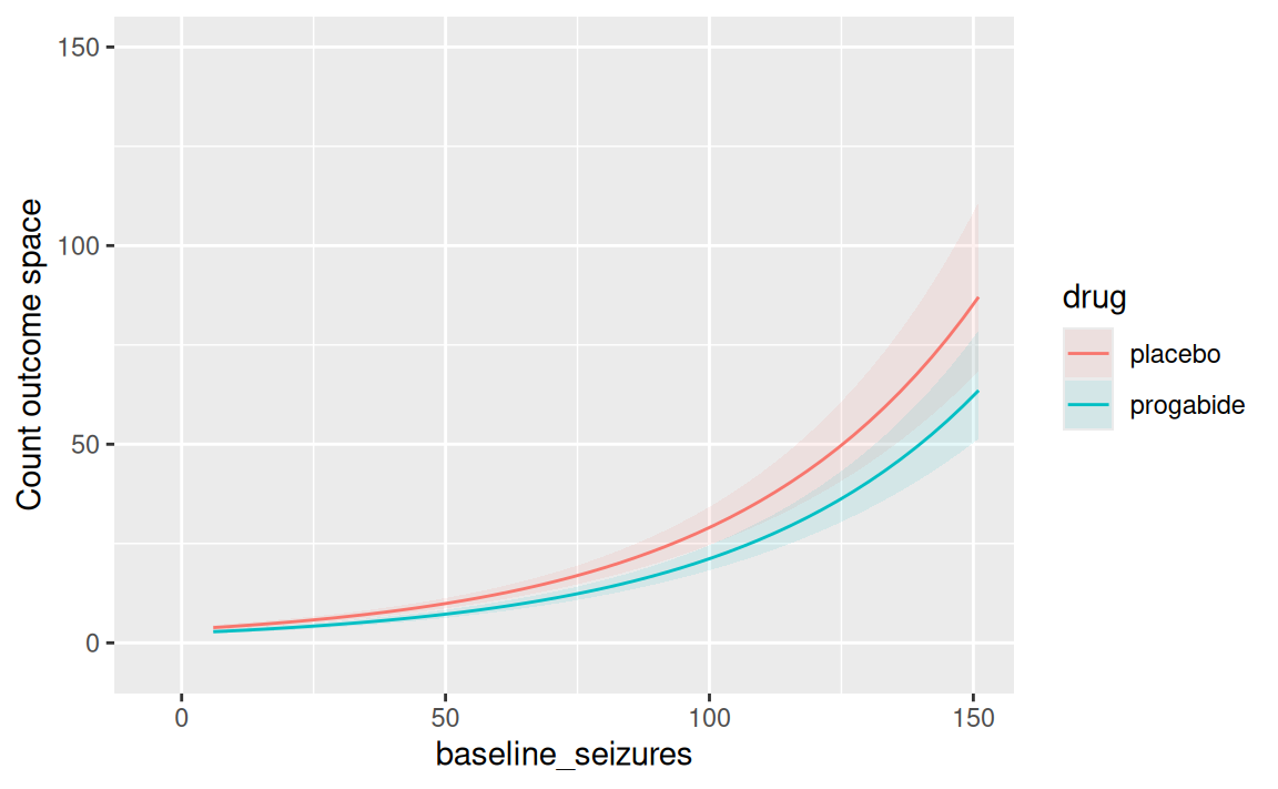
Now, we can appreciate how the model computes it’s expectation for the average effect of progabide as a function of baseline_seizures.
Note that we did not add an interaction in m2_baseline, but that it is still producing a conditional effect of progabide as a function of baseline_seizures. How did it do that!? 👀
The trick is the log link. In a Poisson model, we model the log of the expected seizure count:
\[ \log\left( E[Y] \right) = \beta_0 + \beta_1\,drug + \beta_2\,baseline\_seizures \]
Model m2_baseline did not fit an interaction in the log-space.
But when we transform back to the outcome scale, we add the \(x_i\) of all the coefficients:
\[ E[Y] = e^{\beta_0+\beta_1\,drug+\beta_2\,baseline\_seizures} \]
So baseline_seizures is always part of the equation and therefore affects the predicted effect of drug on the outcome scale (i.e., counts) — even though we never explicitly computed a drug × baseline_seizures interaction.
In other words, the effect of drug is conditional on the baseline value through the nonlinear log-link transformation. That’s why plot_predictions() can show a conditional drug effect across different levels of baseline_seizures without an interaction term in the model.
TipThe matematical nerd intuition
Start with the Poisson model:
\[ \log(λ) = \beta_0 + \beta_1\,drug + \beta_2\,baseline_seizures \]
Back-transform to the response scale:
\[ λ = \exp\left( \beta_0 + \beta_1\,drug + \beta_2\,baseline\_seizures \right) \]
Take the derivative with respect to drug:
\[ \frac{\partial λ}{\partial drug} = \beta_1 \exp\left( \beta_0 + \beta_1\,drug + \beta_2\,baseline\_seizures \right) \]
Or equivalently:
\[ \frac{\partial λ}{\partial drug} = \beta_1λ \]
Because λ contains baseline_seizures, the effect of drug on the response scale depends on baseline_seizures.
The cross-partial derivative makes this explicit:
\[ \frac{\partial^2λ} {\partial drug\,\partial baseline\_seizures} = \beta_1\beta_2 \exp\left( \beta_0 + \beta_1\,drug + \beta_2\,baseline\_seizures \right) \]
Thus, whenever \(\beta_1 \neq 0\) and \(\beta_2 \neq 0\):
\[ \frac{\partial^2λ} {\partial drug\,\partial baseline\_seizures} \neq 0 \]
So the nonlinear inverse link creates an interaction on the outcome scale, even though there is no explicit drug × baseline_seizures interaction term in the model.
Importantly, this is not an interaction in the linear predictor. It is a response-scale interaction induced by the nonlinear inverse link.
14.12 A direct comparison of Gaussian and Poisson regression
What would have happened, had we used our good-old linear model?
Let’s try!
# A tibble: 3 × 7
  term          estimate std.error statistic  p.value conf.low conf.high
  <chr>            <dbl>     <dbl>     <dbl>    <dbl>    <dbl>     <dbl>
1 (Intercept)      0.260    1.27       -1.06 2.92e- 1   0.0205      3.29
2 drugprogabide    0.222    1.37       -1.10 2.76e- 1   0.0143      3.45
3 baseline_sei…    1.35     0.0257     11.8  8.40e-17   1.29        1.42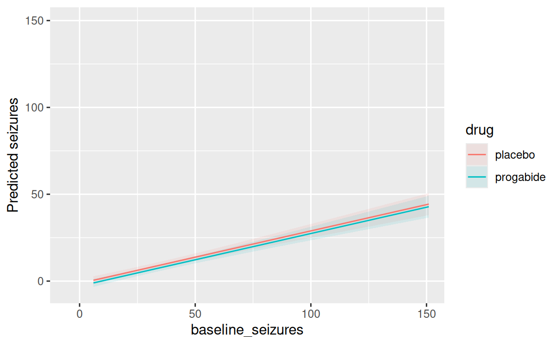
Notice that:
- The predicted seizure count at follow-up produces negative values for the treatment group with low disease burden. This is of course nonsense!
- The interaction effect makes the drug effect flip at around 50
baseline_seizures. This is surprising and would require rigorous follow-up tests.
14.13 Reading task: Shifting perspectives - from absolute counts to relative rates
Until now, we have considered the outcome scale as an absolute count. This is nice when working with balanced groups or individual-level inference. But often, we work with large populations with different seizes. In such cases, we should interpreted the parameter, λ, as a rate.
What is a rate?
A rate tells us how much one thing changes compared with another. In simple terms, it answers the question:
“How much of something happens for each unit of something else?”
Rates are especially useful in biomedical science because many biological processes happen over time. For example, we can describe how quickly a patient’s heart rate changes, how fast a drug is eliminated from the body, or how quickly a wound heals.
A rate is usually written as a fraction:
\[ rate = \frac{{\text{change in Y}}}{\text{for X unit}} \]
The denominator tells us what we are measuring the change against, such as time, while the numerator tells us what is changing.
14.13.1 The offset
Implicitly, λ is equal to an expected number of events, μ, per unit time or distance, τ. This implies that \(λ = \frac{μ}{τ}\), which lets us redefine the link:
\[ y_i \sim Poisson(λ_i) \\ log λ_i = log \frac{μ_i}{τ_i} = α + βx_i \]
Since the logarithm of a ratio is the same as the difference of logarithms:
\[ log λ_i = log μ_i - log τ_i = α + βx_i \]
These τ are the “exposures”. If different observations i have different exposures, the expected value on row i is given by
\[ log μ_i = log τ_i + α + βx_i \]
When \(τ_i = 1\), then \(logτ_i = 0\) and we’re back to standard Poisson!
But when the exposure is not 1, τ does effectively scales the expected number of events for each case i in the unit \(x = 1\) (1 day, year, whatever…). Therefore, we write:
\[ y_i \sim Poisson(μ_i) \\ log μ_i = log τ_i + α + βx_i \]
Where τ is a column in the data. It’s just like adding a predictor (taking its log) without adding a parameter for it!
If you put a parameter in front of τ, you’re able to model the hypothesis that the rate is not constant with time.
Remember: When the length of observations, area of sampling, or intensity of sampling varies, the counts we observe also naturally vary! Poisson assumes stationarity (time/space) — here, we add an offset! That is — the logarithm of the exposure unit.
14.13.2 Simulating an example:
Consider the case of reporting events (e.g., death) at two hospitals. Hospital 1 records daily events (30 observations of one day each), while Hospital 2 records weekly events (4 observations, each representing seven days).
If we simply modeled the raw event counts, Hospital 2 would naturally tend to have larger counts because each observation covers a longer period of time.
set.seed(636961739)

num_weeks <- 8 # weeks of the experiment
num_days <- 8*7 # days of the experiment

hospital1 <- rpois(num_days, 1.5) # 1.5 events per day

hospital2 <- rpois(num_weeks, 0.5*7) # 0.5 events per day scaled to a week

events <- c(hospital1, hospital2)
exposure <- c(rep(1,num_days), rep(7,num_weeks))
hospital_id <- c(rep("Aalbjerg",num_days), rep("Esborg",num_weeks))
hospital_data <- data.frame(
  events=events,
  days=exposure,
  hospital_id= as.factor(hospital_id)
)

hospital_data$log_days = log(hospital_data$days)

hospital_data
# A tibble: 64 × 4
events days hospital_id log_days
<int> <dbl> <fct> <dbl>
1 0 1 Aalbjerg 0
2 5 1 Aalbjerg 0
3 1 1 Aalbjerg 0
4 4 1 Aalbjerg 0
5 1 1 Aalbjerg 0
6 0 1 Aalbjerg 0
7 3 1 Aalbjerg 0
8 0 1 Aalbjerg 0
9 0 1 Aalbjerg 0
10 2 1 Aalbjerg 0
# ℹ 54 more rowsWe have generated a dataset where we have:
-
events: number of events -
days: how many das the events have been counted and summed over -
hospital_id: unique ID of the hospital {EsborgorAalbjerg} -
log_days: taking the log ofdays
14.14 Modelling without thinking
# A tibble: 2 × 5
  term              estimate std.error statistic     p.value
  <chr>                <dbl>     <dbl>     <dbl>       <dbl>
1 (Intercept)           1.68     0.103      5.02 0.000000512
2 hospital_idEsborg     2.23     0.210      3.83 0.000126
Oh, wow! Esborg has a 2.2340426 incidence rate ratio compared to Aalbjerg!
How many counts is that? Intercept (Aalbjerg estimate) 1.6785714 × \(β_{Esborg}\) 2.2340426 is 3.75.
That is alarming and someone should figure out why so many events are taking place in Esborg compared to Aalbjerg!
Let’s add an offset and see what this gives us:
# A tibble: 2 × 5
  term              estimate std.error statistic      p.value
  <chr>                <dbl>     <dbl>     <dbl>        <dbl>
1 (Intercept)          1.68      0.103      5.02 0.000000512
2 hospital_idEsborg    0.319     0.210     -5.45 0.0000000514
Oh, no! Now Esborg has a 0.3191489 incidence rate ratio compared to Aalbjerg!
How many counts is that now? Intercept (Aalbjerg estimate) 1.6785714 × \(β_{Esborg}\) 0.3191489 is 0.5357143.
How can this be? What should we trust?
As always, models are no source of truth and trying to reading coefficients blindly is a poor choice - there lies madness.
Instead, we should make clear expectations and seek out models that are capable of addressing our needs to inquire knowledge.
14.14.1 Explicitly stating our expectations:
In this simulation, Aalbjerg was generated with an average rate of 1.5 events per day, while Esborg was generated with an average rate of 0.5 events per day. Therefore, we expect a correct fitted model to recover:
An intercept corresponding to approximately 1.5 events per day
-
An exponentiated coefficient for
hospital_idEsborgof approximately\[ \frac{0.5}{1.5} ≈ 0.33. \]
This means Esborg has about one-third the event rate of Aalbjerg (equivalently, about a 67% points lower event rate). Since we are fitting a Poisson model, this exponentiated coefficient is interpreted as an incidence rate ratio (IRR).
Note: Small differences between the estimated and true values are expected because the data are randomly simulated and we have low sample size.
14.14.2 Making sound inference:
Notice that when we simply model the raw event counts, Esborg will naturally have larger counts. Why? Because each observation covers a longer period of time (here a full week) compared to that of Aalbjerg (only a single day). This is in contrast to our expectation.
The offset corrects for this by incorporating the amount of exposure into the model. Specifically, we include the logarithm of the exposure log_days as an offset:
\[ log μ_i = log (days_i) + α + β1hospital_i \] Because the offset has a coefficient fixed at 1, the model estimates event rates (events per day) rather than raw counts. This allows observations with different exposure times to be compared on the same scale. The estimates are much closer to our expectation this time.
We could also model the week rate ratio by multiplying the day unit by 7:
\[ log μ_i = log (days_i × 7) + α + β1hospital_i \]
In R, we would simply multiply the expoure variable by 7:
# A tibble: 2 × 5
  term              estimate std.error statistic   p.value
  <chr>                <dbl>     <dbl>     <dbl>     <dbl>
1 (Intercept)         11.8       0.103     23.9  4.09e-126
2 hospital_idEsborg    0.319     0.210     -5.45 5.14e-  8
The incidence rate ratio stays the same between the hositals
\[ \frac{0.5 * 7}{1.5 * 7} = \frac{3.5}{10.5} ≈ 0.33. \]
But now the intercept is 11.75 — effectively seven times as large!
This way, you are in charge of what exposure time you want to report 🎉
14.15 Logistic vs Poisson for binary outcomes
As you might have noted in the simulation above, the outcome was actually binary (event happened or not) — shouldn’t we use logistic regression for such outcomes?
Recall Section 14.6 — when the rate is low, a binomial distribution transform into the Poisson distribution. So some binary events can be modeled as Poisson, given a few assumptions:
- low rate
- variance scales with n (see Section 14.6).
In practice, however, many epidemiologists use Poisson regression to model binary outcomes with relatively high rate and where the variance assumption is not met. The reason is that the analyst want an estimate of the risk ratio and not the odds ratio. Unfortunately, this creates too low standard errors, which leads to unrealisticly narrow confidence intervals.
See the compendium for explanations of the difference in risk and odds ratios.
14.15.1 Correct interpretation of Poisson models with binary outcomes
Count ratio, incidence rate ratio, risk ratio, odds ratio…
What is the output of a Poisson model? 😅
There is a simple set of rules governing this, which you need to remember when interpreting coefficients of Poisson models.
A relative risk compares the risk (cumulative incidence) of an outcome between groups:
\[ RR = \frac{\text{Risk in exposed group}}{\text{Risk in unexposed group}} \]
Suppose 10 out of 100 patients die at hospital A, while 5 out of 100 dies at hospital B.
The (unadjusted) relative risk between the two hospitals is
\[ RR = \frac{10\%}{5\%} = 2 \]
So, hospital A has 2 times the risk of death.
An incidence rate ratio compares the rate at which new cases occur, taking into account how much person-time people are observed. So this is only relevant if you have a time-to-event outcome — in other words: You added an offset!
This is what we did in the simulation example above.
1.5 events per day vs 0.5 events per day gives a 0.33 incidence rate ratio.
14.15.2 Adjusting the rate ratio standard deviation for Poisson models
Estimating a relative risk from binary outcome data requires a modified Poisson regression (using robust standard errors) rather than a standard Poisson model (see (1)).
This is how you could compute that in R:
# grab dataset
birthwt <- MASS::birthwt

# 1. Fit standard Poisson GLM with log link on binary data
model_rr <- glm(
  low ~ smoke + age + ht + ui,
  family = poisson(link = "log"),
  data = birthwt
)

# crude estimate of RR
misleading_rr <- parameters::model_parameters(
  model_rr,
  exponentiate = TRUE  # Get unadjusted risk ratio
)

# Alternative: Average Risk Ratio w/ robust std.err.
modified_rr <- avg_comparisons(model_rr,
                variables = "smoke",
                comparison = "lnratioavg", # Calculates adjusted Risk Ratio
                transform = exp, # then exponentiates
                vcov = sandwich::vcovHC(model_rr, type = "HC3")) # Applies robust standard errors due to poisson regression approach
Note the two important parameters:
comparison = "lnratioavg"
This argument tells marginaleffects to calculate the relative risk. It computes the log of the ratio of predicted probabilities, averages them across your sample, and then transforms them back to the risk ratio scale.
vcov = vcovHC(...)
This step is crucial for the Poisson model. It corrects the standard errors for the binomial nature of your binary data, preventing falsely narrow confidence intervals.
Finally, we can appreciate the difference of the estimates using a plot:
df <- bind_rows(
  broom::tidy(modified_rr, conf.int = TRUE) |>
    dplyr::filter(term == "smoke") |>
    dplyr::mutate(
        measure = "modified_RR"
    ),
  broom::tidy(model_rr,
  conf.int = TRUE,
  exponentiate =TRUE) |>
    dplyr::filter(term == "smoke") |>
    dplyr::mutate(measure = "misleading_RR")
    ) |>
  dplyr::transmute(measure, estimate, conf.low, conf.high)

ggplot(df, aes(estimate, measure)) +
  geom_point() +
  geom_errorbarh(aes(xmin = conf.low, xmax = conf.high), width = 0.2) +
  theme_minimal() +
  geom_vline(xintercept = 1)
Warning: `geom_errorbarh()` was deprecated in ggplot2 4.0.0.
ℹ Please use the `orientation` argument of `geom_errorbar()` instead.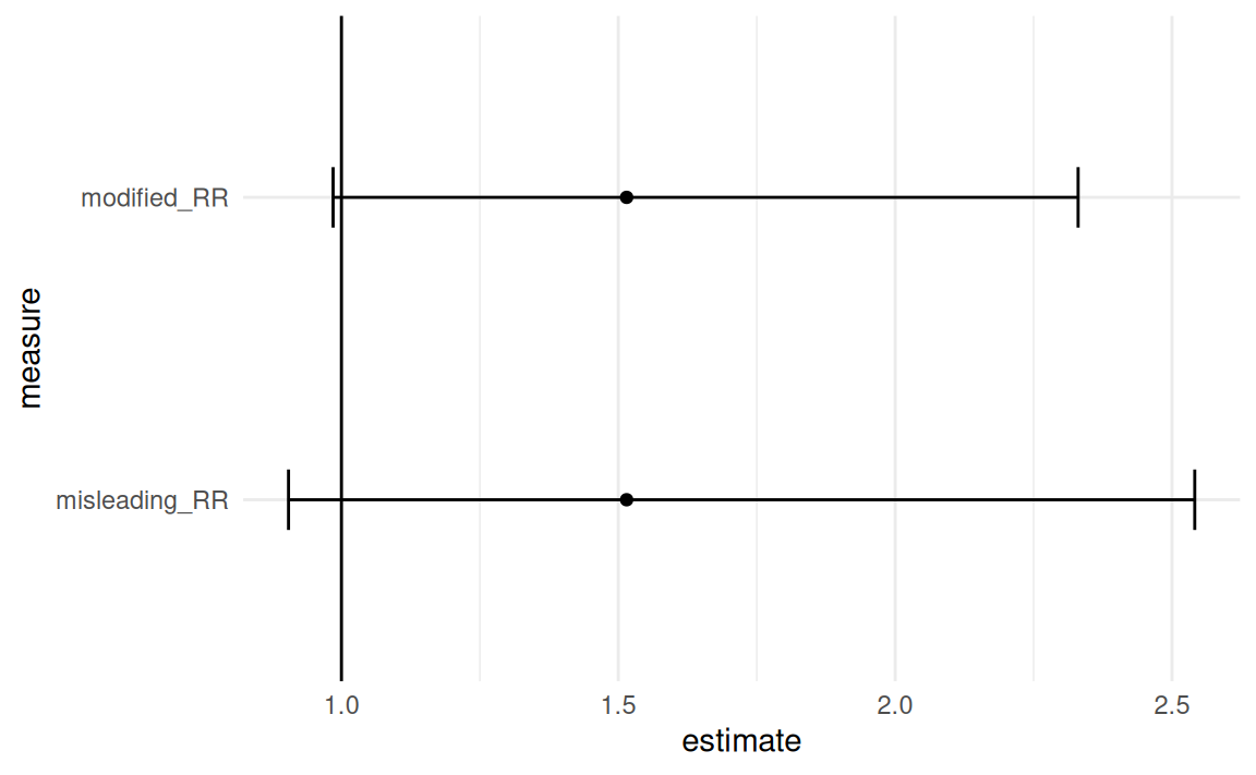
Note that while the estimate remains the same, the standard error is adjusted. This leads to different confidence intervals, and eventually also different p-value.
14.16 Summary:
This session introduced the Poisson distribution and how to use it in regression (within the GLM framework). We covered it’s relationship to logistic regression and why it’s necessary in favor of the gaussian linear regression. We also covered how the coefficients are interpreted (incidence rate-ratio), and how we invert the coefficients (taking it’s exponential). Finally, we covered the assumptions (dispersion) and how to adjust different exposure times (including an offset).
14.17 EXTRA MATERIAL
14.18 Telling your model that people respond differently
What a cool model we have! But wait… Did we check for any assumptions yet? And what are the assumptions specific to Poisson regression?
14.18.1 The theory
Our Poisson model assumes that the number of seizures follows a Poisson distribution,
\[ Y_i \sim \text{Poisson}(\mu_i), \]
where the expected seizure count is modeled using a log link,
\[ \log(\mu_i) = \beta_0 + \beta_1\text{drug}_i + \beta_2\text{baseline}_i + \beta_3(\text{drug}_i \times \text{baseline}_i). \]
A key assumption of the Poisson distribution is that the mean and variance are equal,
\[ \mathbb{E}[Y_i] = \mathrm{Var}(Y_i) = \mu_i. \]
In medical data, this assumption is often unrealistic. Some patients are inherently more prone to seizures than others because of unmeasured factors such as disease severity, genetics, medication adherence, or other clinical characteristics. Consequently, the observed variability is often much larger than the Poisson model expects. This phenomenon is termed overdispersion.
The DAG (from the beginning of the session) illustrates one possible explanation for this extra variability. Patients differ in their underlying disease severity, which influences both baseline seizure counts and GABA activity. Although treatment affects GABA, there may still be patient-to-patient differences that are not fully captured by the measured baseline seizure count. These unobserved differences create rate heterogeneity — each patient has their own underlying seizure rate rather than sharing one common rate.
Rather than assuming a single Poisson rate for every individual, the negative binomial model assumes that each patient has their own Poisson rate,
\[ Y_i \mid \lambda_i \sim \text{Poisson}(\lambda_i), \]
where these individual rates themselves follow a Gamma distribution,
\[ \lambda_i \sim \text{Gamma}(\alpha,\beta). \]
Integrating over this distribution of rates produces the negative binomial distribution. For this reason, the model is often called the gamma-Poisson model.
This idea is similar to the Student’s \(t\) distribution. A Gaussian distribution assumes one common variance, whereas the Student’s \(t\) can be viewed as a mixture of Gaussian distributions with different variances. Likewise, the negative binomial is a mixture of Poisson distributions with different event rates.
The consequence is that the variance is no longer constrained to equal the mean. Instead,
\[ \mathrm{Var}(Y_i) = \mu_i + \frac{\mu_i^2}{\theta}, \]
where \(\theta\) is the dispersion parameter estimated from the data.
As \(\theta \rightarrow \infty\),
\[ \mathrm{Var}(Y_i) \rightarrow \mu_i, \]
so the negative binomial model reduces to the ordinary Poisson model.
14.18.2 The practice
Before fitting a negative binomial model, it is useful to check whether the Poisson assumptions appear reasonable. The performance::check_overdispersion() function compares the observed variability with the variability expected under the fitted Poisson model. Evidence of substantial overdispersion suggests that the Poisson model is likely underestimating uncertainty.
The performance::check_model() function provides additional diagnostic plots for evaluating the adequacy of the fitted model. If overdispersion is present, we can fit a negative binomial model using MASS::glm.nb(). The interpretation of the regression coefficients remains unchanged: exponentiating a coefficient gives the multiplicative change in the expected seizure rate, just as in the Poisson model. The only difference is that the negative binomial model explicitly allows for unexplained patient-to-patient variability.
performance::check_overdispersion(m2_baseline)# Overdispersion test
dispersion ratio = 2.526
Pearson's Chi-Squared = 141.437
p-value = < 0.001Overdispersion detected.performance::check_model(m2_baseline)
m3_nb <- MASS::glm.nb(seizure_count ~ drug * baseline_seizures,
data = epil
)
performance::check_model(m3_nb)To illustrate the difference between these distributions, the figure below simulates data using the observed mean and standard deviation of the epilepsy data. The Gaussian distribution allows impossible negative seizure counts, while the Poisson distribution is restricted to non-negative integers but produces too little variability because its variance equals its mean. The negative binomial distribution remains discrete and non-negative while accommodating the larger variance observed in the data, making it a much more realistic model for seizure counts.
mu <- mean(epil$seizure_count) # 7.305085
sigma <- sd(epil$seizure_count) # 9.649467
set.seed(363461174)
dist_draws <- data.frame(
    gaussian = rnorm(1000,mu,sigma),
    poisson = rpois(1000,mu),
    negbin = rnbinom(1000, mu = mu, size = mu^2 / (sigma^2 - mu)) # Variance = mu + mu^2/size - solve for size!
) |>
tidyr::pivot_longer(
    cols = c("gaussian","poisson","negbin"),
    names_to = "dist",
    values_to = "value" )

dist_draws |> ggplot() +
    geom_histogram(
        aes(x=value), bins=30
    ) +
    facet_wrap(~dist) +
    labs(x="seizures")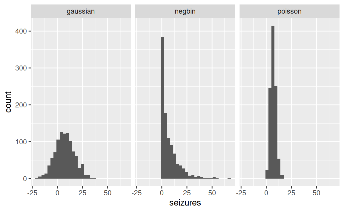
This time, what do you notice? Compare the plots to the observed data we plotted juin the beginning of the session.
- Which best captures the data?
- Which makes the worst fit?
- What else do you notice?
Hidden material on prediction
manual predictions:
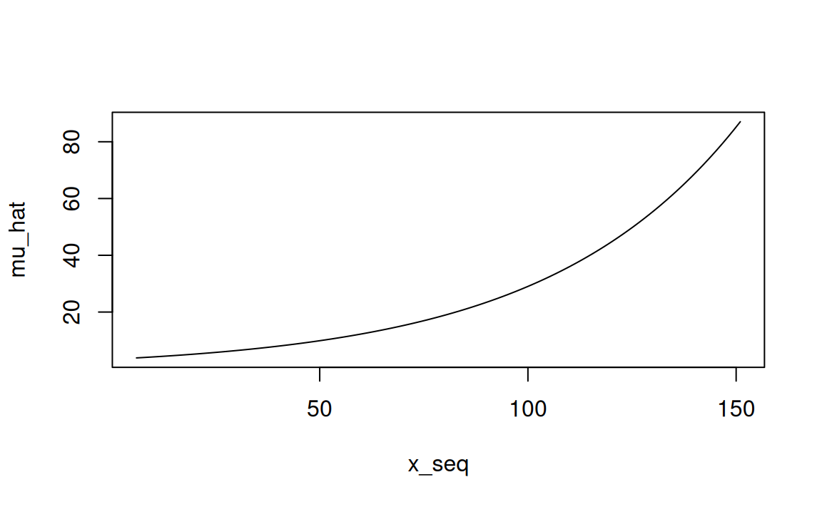
# placebo
newdata <- data.frame(
  baseline_seizures = x_seq,
  drug = "placebo"
)
newdata$mu_hat <- predict(
  m2_baseline,
  newdata = newdata,
  type = "response"
)

# progabide
newdata2 <- data.frame(
    baseline_seizures = x_seq,
    drug = "progabide"
)
predict(m2_baseline, newdata2, type = "response")
1 2 3 4 5 6 7
2.797788 2.887444 2.979973 3.075467 3.174021 3.275734 3.380705
8 9 10 11 12 13 14
3.489041 3.600848 3.716238 3.835326 3.958230 4.085073 4.215980
15 16 17 18 19 20 21
4.351082 4.490514 4.634414 4.782925 4.936195 5.094376 5.257627
22 23 24 25 26 27 28
5.426109 5.599990 5.779443 5.964647 6.155786 6.353050 6.556635
29 30 31 32 33 34 35
6.766744 6.983586 7.207377 7.438339 7.676703 7.922705 8.176590
36 37 38 39 40 41 42
8.438611 8.709028 8.988112 9.276138 9.573394 9.880176 10.196789
43 44 45 46 47 48 49
10.523548 10.860778 11.208814 11.568004 11.938704 12.321283 12.716121
50 51 52 53 54 55 56
13.123613 13.544163 13.978189 14.426124 14.888413 15.365516 15.857908
57 58 59 60 61 62 63
16.366079 16.890534 17.431796 17.990402 18.566910 19.161891 19.775939
64 65 66 67 68 69 70
20.409664 21.063697 21.738689 22.435311 23.154257 23.896241 24.662003
71 72 73 74 75 76 77
25.452303 26.267929 27.109692 27.978429 28.875005 29.800312 30.755271
78 79 80 81 82 83 84
31.740832 32.757976 33.807714 34.891091 36.009185 37.163109 38.354011
85 86 87 88 89 90 91
39.583075 40.851526 42.160624 43.511672 44.906015 46.345040 47.830180
92 93 94 95 96 97 98
49.362911 50.944758 52.577297 54.262150 56.000995 57.795562 59.647636
99 100
61.559061 63.531737 mu_prog <- exp(
b["(Intercept)"] +
b["drugprogabide"] +
(b["baseline_seizures"] + b["drugprogabide:baseline_seizures"]) * x_seq
)
data.frame(x=x_seq,y=mu_prog) |>
ggplot(aes(x=x,y=y)) +
geom_line()Warning: Removed 100 rows containing missing values or values outside the scale
range (`geom_line()`).
#X <- model.matrix(~ trt + base + `trtprogabide:base`, newdata)
#X <- model.matrix(~ trt * base, newdata)
tt <- delete.response(terms(m2_baseline))

X <- model.matrix(
  tt,
  newdata,
  xlev = m2_baseline$xlevels
)

newdata$mu_hat <- exp(X %*% coef(m2_baseline))

exp(X %*% coef(m2_baseline)) == predict(
  m2_baseline,
  newdata = newdata,
  type = "response"
)
[,1]
1 TRUE
2 TRUE
3 TRUE
4 TRUE
5 TRUE
6 TRUE
7 TRUE
8 TRUE
9 TRUE
10 TRUE
11 TRUE
12 TRUE
13 TRUE
14 TRUE
15 TRUE
16 TRUE
17 TRUE
18 TRUE
19 TRUE
20 TRUE
21 TRUE
22 TRUE
23 TRUE
24 TRUE
25 TRUE
26 TRUE
27 TRUE
28 TRUE
29 TRUE
30 TRUE
31 TRUE
32 TRUE
33 TRUE
34 TRUE
35 TRUE
36 TRUE
37 TRUE
38 TRUE
39 TRUE
40 TRUE
41 TRUE
42 TRUE
43 TRUE
44 TRUE
45 TRUE
46 TRUE
47 TRUE
48 TRUE
49 TRUE
50 TRUE
51 TRUE
52 TRUE
53 TRUE
54 TRUE
55 TRUE
56 TRUE
57 TRUE
58 TRUE
59 TRUE
60 TRUE
61 TRUE
62 TRUE
63 TRUE
64 TRUE
65 TRUE
66 TRUE
67 TRUE
68 TRUE
69 TRUE
70 TRUE
71 TRUE
72 TRUE
73 TRUE
74 TRUE
75 TRUE
76 TRUE
77 TRUE
78 TRUE
79 TRUE
80 TRUE
81 TRUE
82 TRUE
83 TRUE
84 TRUE
85 TRUE
86 TRUE
87 TRUE
88 TRUE
89 TRUE
90 TRUE
91 TRUE
92 TRUE
93 TRUE
94 TRUE
95 TRUE
96 TRUE
97 TRUE
98 TRUE
99 TRUE
100 TRUEThis last expression,
exp(X %*% coef(fit))
is essentially what predict.glm(type = “response”) computes internally. It’s the most general way to think about GLM predictions: construct the design matrix X, multiply by the coefficient vector β to get the linear predictor η=Xβ, then apply the inverse link function. For a Poisson model with the log link, the inverse link is simply exp().
The predicted values in a generalized linear model are obtained using matrix multiplication of the design matrix and the estimated coefficient vector.
Let the design matrix be
\[ X = \begin{bmatrix} 1 & 0 & 6.0 & 0 \\ 1 & 0 & 7.46 & 0 \\ \vdots & \vdots & \vdots & \vdots \\ 1 & 0 & 151 & 0 \end{bmatrix}, \]
and let the estimated regression coefficients be
\[ \hat{\beta} = \begin{bmatrix} 1.29584 \\ -0.24923 \\ 0.02145 \\ 0.00042 \end{bmatrix}. \]
The linear predictor is obtained by matrix multiplication:
\[ \eta = X\hat{\beta}. \]
In R, this is computed as
Here,
- \(X\) is a \(100 \times 4\) design matrix,
- \(\hat{\beta}\) is a \(4 \times 1\) coefficient vector,
- \(\eta\) is a \(100 \times 1\) vector of linear predictors.
For the first observation, the linear predictor is computed as the product of the first row of \(X\) and the coefficient vector:
\[ \eta_1 = \begin{bmatrix} 1 & 0 & 6 & 0 \end{bmatrix} \begin{bmatrix} 1.29584\\ -0.24923\\ 0.02145\\ 0.00042 \end{bmatrix} = 1(1.29584) +0(-0.24923) +6(0.02145) +0(0.00042) = 1.42453. \]
This row-by-column multiplication is an inner product, also called a dot product, between the first row of the design matrix and the coefficient vector.
Thus,
The overall computation, \[ \eta = X\hat{\beta}, \] is matrix multiplication.
Each individual fitted value, \[ \eta_i = x_i^\top \hat{\beta}, \] is an inner product (dot product).
Since this is a Poisson generalized linear model with a log link, the predicted mean response is obtained by applying the inverse link function:
\[ \hat{\mu} = \exp(\eta). \]
In R:
A cross product is not being computed here. In vector algebra, the cross product is defined only for three-dimensional vectors and produces another vector. Although R has a function named crossprod(), it computes
\[ X^\top Y, \]
which is a matrix product, not the geometric cross product.